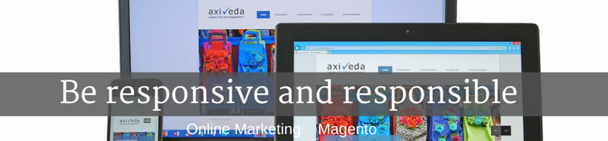
Being responsible is crucial in every business, but what does being responsive means for those entrepreneurs with online based business? It is really a matter of money if you get that 17% of nowadays usage of the web comes from mobile devices and this is an ongoing process. But responsive is so much more…

source: http://www.abookapart.com/
WHAT DOEAS RESPONSIVE MEAN?
It is all about flexibility and usability. Basically responsive web designs with grid frameworks, flexible images, configure media queries and responsive styles and are used to make your site adaptable to all sorts of screen sizes. Not only should they be suitable for mobile phones, also smartphones, tablets, desktops and all kinds of browsers. With responsive design you can choose which items on your page will be your priorities, shown even on the smallest screen perfectly.
For instance like here:

source: http://www.peterjacksons.com/store
WHY YOU SHOULD BE RESPONSIVE?
If you’re responsive in the web, you look good and professional everywhere, so that people can find you almost everywhere and think – that looks great and I am interested. So responsive in the end means adaptable to your user and that is crucial for gaining more attached users to your business.
Another thing is that responsive deign is a web design solution approved by Google what equals with improving your sites ranking in search engines. Browsers are also preparing for responsive websites. Google Chrome edition 34 for instance makes it possible to set different sizes of graphics for different definition on devices. From retailer’s point of view it is also important that being responsive means the platform can scale into many thousands of orders per day or huge catalogs. Also to track potential client 24 hours a day for 360 degrees you have to be responsive. That way your business can grow, expend and so should your platform.
Responsive is not only earning, but also saving money and time for the future. Instead of creating various website versions for different devices, which is extremely expensive and impractical, you create one responsive design to all screens at the same time. Especially with the newest Magento version 1.9 it is a matter of simple click!
CHECK IF YOUR SITE IS RESPONSIVE
Wondering how to check, if your site is responsive and how you look on different devices? It is importent to check, if the content fits perfectly and is emphasis on the item it should.
So here some tips for you to do it fast.
- There is the obvious way of checking how the site looks like on mobile, tablet by switching on these devices, but…
- If you don’t have a smartphone in your hand at the moment, you can check via Firefox browser. Just try this shortcut while using it: CTRL+SHIFT+M
- You can also check your site here: http://www.responsinator.com.
- If you are looking for more details you can also use Page Speed Insights test. It will show you specifically if and what should you improve to level up your User Experience on mobile devices.
 (No Ratings Yet)
 Loading...