Magento is a powerful eCommerce platform that allows you to create a custom checkout experience. In this case, customization is really important as a smooth payment process increases the conversion rate and distinguishes your store from the others.
A critical feature of Magento, as well as all eCommerce platforms, is the checkout process, which must be efficient and user-friendly in order to encourage customers to buy products. In order to achieve your business goals, you need to make sure the checkout process is fast and easy for your customers.
In this blog post, we will discuss some tips for creating a Magento checkout success page based on our experience and eCommerce surveys conducted by the Baymars Institute. We will also provide examples of effective checkouts from different online stores. And encourage you to test your checkout process regularly to ensure it’s running smoothly.
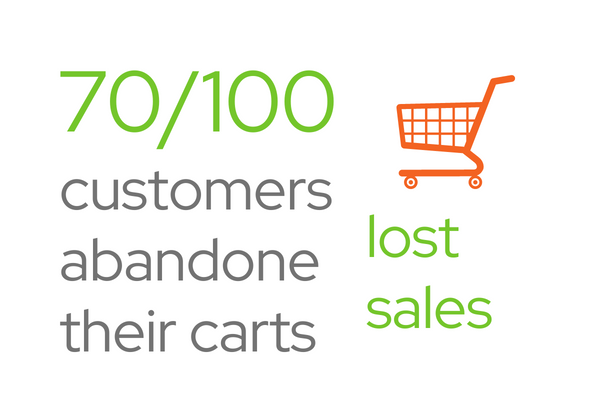
Abandoned carts reasons
One of the most common reasons for abandoned carts is the slow and complicated process. If customers have to spend too much time filling out forms or waiting for pages to load, they’re likely to give up and go elsewhere leaving their shopping carts behind.
For more details about abandoned carts‘ reasons and prevention please read the blog article.
Luckily, there are a few simple steps you can take to speed up your checkout process and reduce cart abandonment. One of the easiest things you can do is streamline your form fields – ask only for the information you absolutely need, and make sure all the fields are clearly labeled.
You should also consider offering multiple payment methods, so customers can choose the one that’s most convenient for them. Finally, make sure your checkout page is mobile-friendly.
The majority of people nowadays are doing their shopping on their smartphones, so it’s important to cater to this growing market. By following these tips, you can minimize cart abandonment and keep your customers happy.
But let’s take a deeper look at the whole process.
Different kinds of checkout
There are three main types:
- One-step / one-page,
- multi-step,
- accordion.
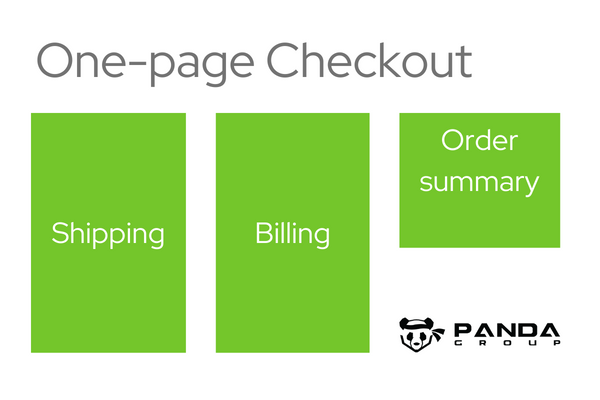
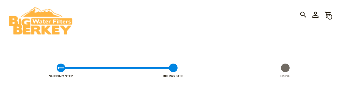
One-step checkout
One-step or one-page became popular as they are considered to be simple and fast. All the necessary form fields are displayed on a single page, so customers can complete their purchase without having to click through multiple pages.
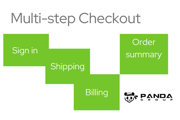
Multi-step checkout
Multi-step consists of several pages. The users fill in the information step by step. From order preview, billing, and shipping info to payments moving forward from one page to another.
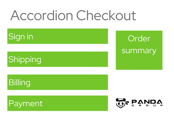
Accordion checkout success page
Accordion means viewing steps in order on one page and moving from top to bottom with step numbers. This type of checkout makes the process seem shorter and easier to follow.
Multi-step checkouts and accordions were popular before one-step became technically possible. But the results of Baymard Institute surveys show that:
It doesn’t matter how many steps the checkout process consists of, but what and how users are asked for when filling in the forms.
Typical checkout length
Baymard discovered that an average checkout length varies from 3 to 5 steps. And 5 steps are the most typical. What’s more, they conclude that one-step does not exist among the top 80 US and European eCommerce sites. They also observe the increasing role of 3 steps.
Design successful checkout
We all know that the number of steps in your checkout is important, but did you realize it’s not as crucial as having too many form fields? In fact, according to Baymard research most sites only need 8 total – yet 2021 averages 11.8 forms per page!
Checkout optimization is an area you should focus on to improve the process and increase the conversion rate to gain customer loyalty.
Checkout process User Experience
Let’s divide the whole process into steps that are usually taken to accomplish a successful purchase. They are similar but designed in different ways, not always respecting users’ expectations and requirements.
Checkout logging and guest option
Most users choose freedom when online purchasing and want to complete shopping without the necessity of account creation. Removing a forced login increases conversion by up to 30%.
At first, users assume they are one-time buyers, and good user experience persuades them to become loyal clients rather than forcing them to create an account to continue shopping.
If you want to make the clients leave their personal data, ask them in the last stage e.g. on the success page, and promise special treatment. Successful purchases may induce a positive attitude to share data on the thank you page.
Guest checkout interface placement
Clients expect to have the possibility of guest shopping without logging necessities, they expect to find the guest option in the most prominent place which is the upper-left part of the screen. The lack of this option or even a different placement makes it confusing and causes cart abandonment.
Mobile buyers also expect to find guest options on the top part of the interface. And usually, it’s hidden and not exposed enough causing confusion when shopping on mobile devices.
Registered customers
When expecting the users to create an account, make this process as simple as possible. If you have complex password-creation requirements, communicate them clearly to prevent users from making mistakes. When mistakes occur, point out the places to correct them. According to Baymard Institute research, 18.75% of users abandon their carts when they approach logging problems.
Shipping and delivery options
As you know multiple shipping and delivery options are required to fulfill users’ expectations. Omnichannel business models give an opportunity for in-store pickup.
Here is an example of a Magento in-store pickup solution. Customers expect to have this option visible enough in comparison with other shipping options. To compare the details of shipping cost and delivery time of all accessible options at a time.
Delivery speed vs delivery date
Giving customers the ability to understand when they will receive their order is a huge advantage. For example, if you were buying something that needed immediate delivery and had an April 4th deadline, then it would be best informed by telling people simply “Delivery On This Day” instead of just giving them dates or ranges. Hence, there’s no confusion about what day/time requires attention most quickly!
Payment method
Payment should support checkout being clear and trustful. Again, various payment options and possibilities are expected depending on the market you operate in. You will probably use pay by a link to the bank website, paywall operator e.g. Google Pay, or Credit Card option. Amazon Pay was found to increase conversions by 8-10%.
This stage of the purchasing process is fragile and requires special attention.
Fraud prevention and security
The customer’s fear of being hacked or scammed is a huge factor in the checkout process. To build trust you need to invest in fraud prevention tools as well as some basic security measures. Also, you need to use the HTTPS protocol, SSL encryption, and data masking in order to protect user-sensitive personal information.

Read more about eCommerce threats in our blog article about anti-fraud protection, and here about Panda Groups’ Subuno fraud prevention module for Magento 2.
Order success page
An order confirmation page is the last step of checkout showing order details. It’s very important to inform customers about order status, billing address, shipping method, and payment details on this page.
Also, you can offer them cross-sell products or suggest subscribing to your newsletter here. Coupon codes or discount coupons may encourage clients to continue shopping and is a good moment for personal data collecting.
Well organized order summary makes a good impression and allows the customer to reorder or make the next purchase in the coming future.
Checkout form optimization
As was said above, the number of form fields is much more critical when it comes to overall usability, rather than how many steps there are.
In fact, it’s tempting to collect more and more information about the users – but increasing the number of fields is not effective for your conversion rate.
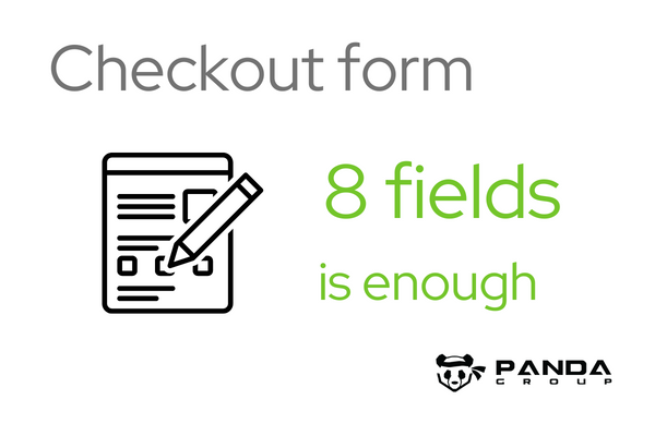
According to Baymard Institute research on checkout process optimization, most sites only need 8 form fields – yet the average is 11.8!
Here is an example of field form optimization.
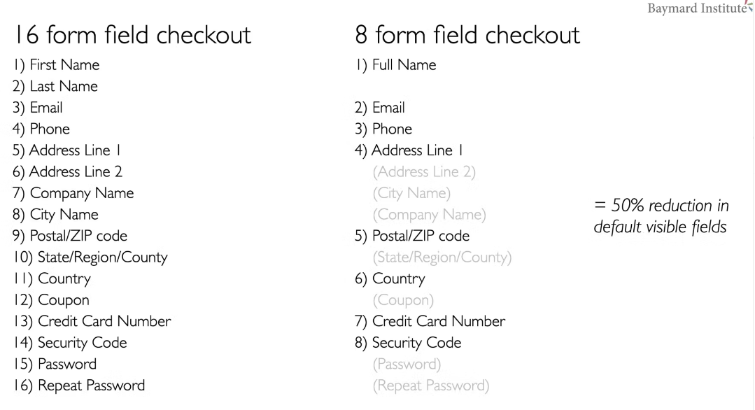
Source: https://baymard.com/blog/checkout-flow-average-form-fields
The first rule in data-collecting is to ask only for data you really need. And explain why you need them eg. telephone for delivery confirmation.
Single fields
People prefer to write names and surnames in one field, you can just make one field instead of two. The same with the address, you can ask to write together the street and the number. This way it is more natural for users and user-friendly 🙂
Hidden fields
Additional fields like address line 2, company name, and coupon Code can be easily hidden not to burden the filling process.
Data filling automatization
To make the process the simplest possible, help the user fill in the fields with data you can collect yourself. Like zip and postal codes, you can get from a database. Countries can be recognized with IP addresses to omit the selected list.
Data formatting
Let the client fill in the fields without formatting – like zip code and telephone number. The user should have a free hand in this matter. You can use automatic formatting in a database if you need to have data arranged in a particular way.
Mistakes correction and prevention
In case formatting is necessary, show exactly how it should be done with examples and if any mistakes are done point out the exact place and way to correct it.
Explain to the users how to fill in the fields, and show your expectations clearly when formatting or password creation. Highlight fields with mistakes and show next to the field how they should be corrected.
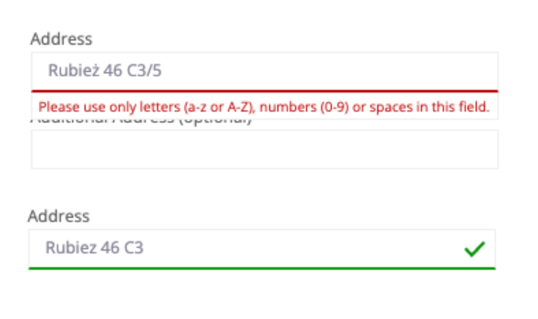
In the real-time show the approval, do not wait for the user’s action. Immediate validation prevents confusion when there are several mistakes. Avoid multi-column layout, users feel confused with several columns. They omit some of them by mistake.
Show progress in more steps checkout, and enable the user to move back and forward when it’s necessary. Editable fields at any stage of the checkout process empower users to change and correct any information they need without losing other data input.
Magento 2 checkout success
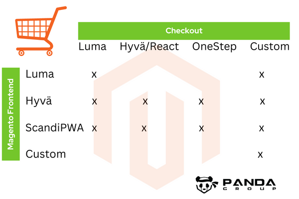
To design and develop a successful Magento checkout you have several options and to make the right choice you need to take into account the Magento frontend you have or plan to develop.
There are several options for the Magento frontend you may use. From Luma the Magento default theme, through ScandiPWA, Hyvä Themes to Custom eCommerce frontend. There are some combinations you may implement in your Magento store to build your own stack adjusted to your individual situation and needs.
We have more and more experience in Hyvä Themes and React Checkout. And now we are testing the Hyvä Checkout beta version. We hope that soon we will be able to give you more information about this new solution. It is presumed to be a Magento game changer, as Hyvä Themes already is.
Just to give you some basic information on the technological difference between the old Luma technology and the new Hyvä stock please read below and to check on the checkout examples have a look at another article on Panda Group’s recommendations on Magento checkout
Hyvä React Checkout
The Hyvä React Checkout module provides a fast-performing Magento 2.3.4. and higher extension which uses this modern framework.
Hyvä React Checkout is a powerful tool with which you can develop your own custom checkout for any site. It’s not a drop-in replacement of the default Luma checkout; instead, it provides necessary components and base options to build something unique if needed!
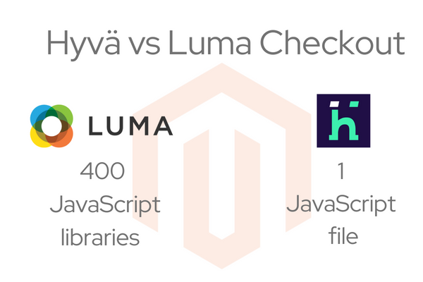
Hyvä React Checkout vs Luma checkout
Luma – Magento’s default checkout – is slow and not performing well enough It requires more than 400 JavaScript libraries. Developing and customizing Luma-based checkout is time-consuming and complex.
While Hyvä React Checkout allows for easy and fast customization thanks to User Interface based on React Components, the checkout page is optimized for speed and performance so it loads quickly, with a single JavaScript file.
Conclusion
When it comes to checkout design and development, Magento offers a wide range of options. From the default Luma checkout to ScandiPWA and Hyvä React Checkout extensions – there is something for every business case.
No matter which option you choose, make sure your checkout page is optimized for speed and performance, has smooth navigation, and includes only necessary fields.
The process should require minimal effort from the user’s side, so give them the possibility to edit and correct data at any step of the checkout process.
And lastly, facilitate data filling by using automation and hidden fields where you can. That way it is more natural for users and user-friendly 🙂
 (No Ratings Yet)