
It’s an online DNA Diagnostics Center and a great example of multi-store. They serve their services to people around at least 6 countries with payment and delivery methods adjusted for each country.

DNA test is an excellent example of the multi-store.
The owner runs 5 similar but not identical online stores in 3 languages and has 2 more inactive stores ready to launch when there will be a right moment for that.
The main layout of the stores looks the same but it doesn’t have to be that way.
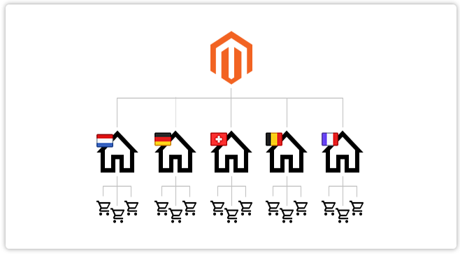
Each store has a separate domain so it can be customized separately – they are not just the different language versions of the same store. What’s more, every store has separate IP addresses what helps SEO.
All stores are operated through one Admin Panel what makes things much easier to use.
The most obvious and the most important difference between DNA test stores are payment methods but there is much more. It starts with all kinds of emails with proper graphics, names and in proper language (e.g. like new order, new order for guests, new invoice, new invoice for guests) and gets to differences in prices.
Everyone knows that design is the business card of the online store. Our client was aware of the importance of the RWD caused by increasing number of users getting to his store by the mobile device and the general Google statements about changes in SEO algorithms issued at the end of 2016.
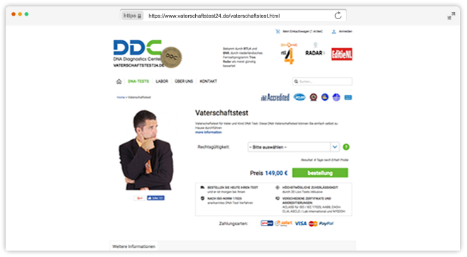
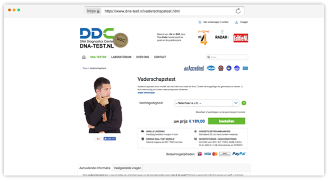
BEFORE: here are screens of old product page design
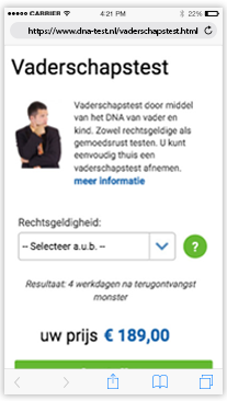
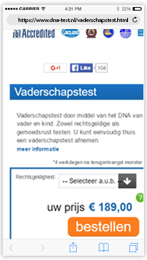
We’ve redesigned mobile version of the store so now it meets the business and users goals, it’s more user-friendly, aesthetic and modern what creates in the user a sense of trust so necessary in the client industry.
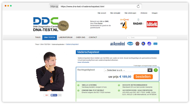
AFTER: and here are our product page designs
We’ve also adjusted the desktop design to make the whole store consistent with minimizing costs by just expanding already existing changes and ideas to higher resolutions.
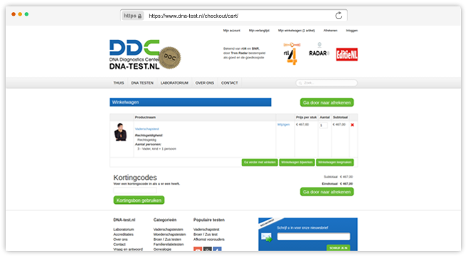
BEFORE: here are screens of old cart design
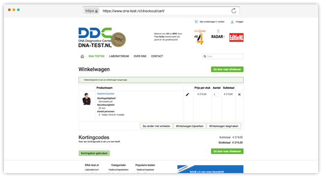
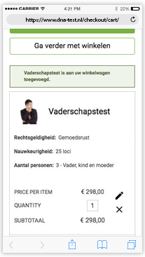
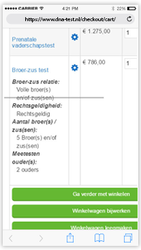
Sometimes minor changes bring benefits in terms of usability. Here is a simple example: we’ve change styles of buttons to make them more recognizable and to settle visual hierarchy.
AFTER: and here are our cart designs

“After some bad experiences in the field of website development, the first project that was done for us by Panda Group was completed on time and within budget. We are furthermore impressed by the level of professionalism with which the specialists working for Panda Group finished the job, their very pleasant and clear communication, their flexibility and reliability.”